
Design the Future
You already know branding matters. But until you see the numbers, you might not realize just how much your visual identity is either silently building your business — or slowly bleeding it.
Most brand conversations stay comfortably in the abstract. “Your logo communicates your values.” “Consistency builds trust.” “First impressions matter.” These things are true — but they’re easy to dismiss without the receipts.
So let’s talk receipts. The data behind branding is more striking than most business owners realize, and once you see it, the question stops being“should we invest in our brand?” and becomes “how have we not done this sooner?”
Here are 7 statistics that reframe the conversation entirely.
STAT #1
That’s all the time it takes for someone to form an opinion about your brand.
Research from Missouri University of Science and Technology found that it takes less than two-tenths of a second for an online visitor to form a first impression of a website — and a further study published in Behaviour & Information Technology narrowed the visual judgment window to just 50 milliseconds(0.05 seconds) for initial aesthetic impressions.
In that sliver of time, your logo, color palette, typography, and layout have already spoken. The question is: what did they say?
“You never get a second chance to make a first impression — and in digital, that impression is measured in milliseconds.
— Peep Laja, CXL Institute
What this means for your brand: Visual clarity and professionalism aren’t a luxury. They’re the price of entry. A polished, intentional logo and landing page can be the difference between a bounce and a conversion before a single word is read.
STAT #2
Single-handedly. Before the name. Before the tagline.
A landmark study by the University of Loyola, Maryland found that color alone can increase brand recognition by up to 80%. Separate research published in the confirmed that color is one of the strongest non-verbal cues a brand can deploy.
80%
increase in brand recognition from color alone
University of Loyola, Maryland
Think about the brands you recognize without needing to read their name. The particular red of a Coca-Cola can. The exact shade of blue on a Tiffany box. The unmistakable orange of Hermès packaging. These aren’t accidents — they’re the result of decades of disciplined color application.
What this means for your brand:Your brand’s color palette isn’t decoration — it’s memory infrastructure. Picking colors intentionally and applying them with absolute consistency is one of the highest-ROI decisions in branding.
STAT #3
Across channels. Across industries. Consistently.
A cross-industry analysis frequently cited by Forbes and Lucid press found that presenting a brand consistently across all platforms can increase revenue by an average of 23%. The underlying driver: consistent brands are easier to remember, easier to trust, and easier to choose.
23%
average revenue lift from consistent brand presentation
Lucidpress / Forbes Brand Report
That figure holds across B2B and B2C, across industries from retail to SaaS, and across company sizes from bootstrapped startups to enterprise brands. Consistency isn’t a big-brand luxury. It’s a universal revenue lever.
What this means for your brand:If your Instagram looks different from your website, which looks different from your email campaigns — you are actively leaving revenue on the table. A unified brand system is not a cost center. It’s a growth investment.
STAT #4
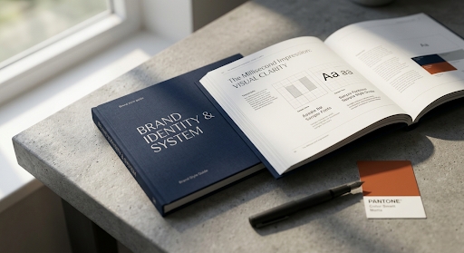
The font you pick is doing more work than you think.
Research from theNielsen Norman Groupand multiple UX studies confirm that typography is the single most dominant element in digital design, influencing perceived credibility, readability, and emotional response. A study byMIT AgeLabfound that typeface choice affects not just aesthetics butcognitive load— the harder a font is to read, the less the brain trusts what it’s reading.
Meanwhile, research on font psychology shows consistent associations between type styles and brand personality: serif fonts signal authority and tradition; geometric sans-serifs communicate modernity and precision; humanist sans-serifs feel approachable and warm. These associations operate below conscious awareness.
“Typography is the voice your brand uses when no one is speaking.
What this means for your brand:Choosing a typeface because it ‘looks nice’ is a missed opportunity. Your font is communicating a personality whether you’ve defined one or not. Define it first, then choose accordingly.
STAT #5
Repetition isn’t annoying. It’s necessary.
According to research aggregated byPam Moore (Marketing Nutz)and widely corroborated in consumer psychology literature, it takes an average of5 to 7 brand impressionsbefore a consumer begins to recognize and remember a brand. In saturated digital markets, that number trends higher.
5–7
impressions needed before brand recognition forms
Consumer Psychology Research Consensus
This is why inconsistency is so damaging. If each impression looks different — different colors, different fonts, different imagery style — those impressions don’t stack. They cancel each other out. You might be generating the impressions, but you’re not building the recognition.
What this means for your brand:Every touchpoint is a deposit into a recognition account. Inconsistency makes withdrawals from that same account. Only brands with a locked-in visual system are able to compound their impressions into genuine recall.
STAT #6
Logic closes deals. Visuals open the door.
Research from the Secretariat of the Seoul International Color Expo found that up to 90% of snap judgments made about products are based on color alone. A broader body of neuromarketing research, including studies by Nielsen Consumer Neuroscience, consistently shows that visual processing precedes and shapes rational evaluation in consumer decisions.
90%
of purchase decisions are influenced by visual factors
Seoul International Color Expo / Nielsen Neuromarketing
Consumers like to believe they make rational decisions. They compare prices, read reviews, and weigh features. But by the time they reach that rational evaluation stage, a visual impression has already tilted the scales. The product that ‘feels right’ before logic kicks in starts with a significant advantage.
What this means for your brand:Your visual identity isn’t just an aesthetic preference — it’s a purchase-decision mechanism. Brands that invest in compelling, coherent visual identity are pre-winning the decision before the pitch even starts.
STAT #7
Recognition isn’t just about being seen. It’s about being remembered.
A Lucidpress State of Brand Consistency Report found that companies with a strong, consistent visual identity experienced up to 3.5 times greater brand visibility than those without one — measured across organic social reach, earned media, and word-of-mouth referral rates.
3.5×
greater brand visibility for visually consistent brands
Lucidpress State of Brand Consistency Report
Visibility compounds. A brand people recognize is a brand people mention, share, and return to. The recognition flywheel — built on consistent visual identity — generates organic growth that paid media simply cannot replicate at the same unit economics.
What this means for your brand: Visual consistency isn’t just about looking polished. It’s an organic growth strategy. Every consistent impression makes the next impression more powerful, and the next, and the next. The brands that win in the long run aren’t always the ones with the biggest budgets — they’re the ones with the most disciplined systems.
So What Do You Do With This?
The data is clear. But data alone doesn’t build a brand. Action does.
If these seven statistics have done their job, you’re no longer thinking about your logo as just a graphic. You’re thinking about it as a recognition engine, a trust signal, a purchase-decision trigger, and a revenue variable.
The next question is simple: does your current brand identity — your logo, your colors, your fonts, your imagery — work hard enough to justify those numbers working in your favor?
If the honest answer is “not quite,” that’s not a failure. It’s a starting point.
“The best time to invest in your brand was when you launched. The second best time is right now.
Want a brand identity that earns these numbers?
The Coast Branding Agency builds done-for-you brand identities for e-commerce founders — logos, color systems, typography, and brand guidelines that work as hard as your marketing budget.